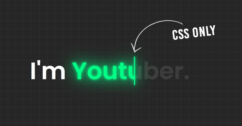
In the world of web design, capturing the attention of visitors is crucial. One effective way to achieve this is through text animation effects. In this article, we’ll explore a simple yet stunning example of text animation using HTML and CSS. You’ll learn how to create a captivating display that will enhance the visual appeal of your website.
What You’ll Learn
- How to structure your HTML for text animation
- CSS styles to create engaging visual effects
- Keyframe animations to bring your text to life
HTML Structure
Let’s start with the HTML code. Here’s a basic structure that includes a heading with animated text:
<html>
<head>
	<title>Simple Text Animation Effects | TechyTechs</title>
	<link rel="stylesheet" href="style.css">
</head>
<body>
	<h2>I'm
		<span style="--i:0;" data-text="Designer.">Designer.</span>
		<span style="--i:1;" data-text="Coder.">Coder.</span>
		<span style="--i:2;" data-text="Youtuber.">Youtuber.</span>
	</h2>
</body>
</html>
Explanation of the HTML Code
- DOCTYPE Declaration: Defines the document type and version of HTML.
- HTML Tags:
html,head, andbodystructure your webpage. - Heading (
<h2>): Contains multiple<span>elements, each representing different roles (Designer, Coder, Youtuber) with custom attributes for animation.
CSS Styles for Animation
Next, let’s create the CSS to style our text and apply the animation:
@import url('https://fonts.googleapis.com/css?family=Poppins:400,500,600,700&display=swap');
*
{
	margin: 0;
	padding: 0;
	box-sizing: border-box;
	font-family: 'Poppins', sans-serif;
}
body
{
	display: flex;
	align-items: center;
	min-height: 100vh;
	background: #262626;
	background-image: linear-gradient(to right,#333 1px,transparent 1px),linear-gradient(to bottom,#333 1px,transparent 1px);
	background-size: 4vh 4vh;
}
h2
{
	color: #fff;
	font-size: 5em;
	font-weight: 600;
	padding: 0 100px;
}
h2 span
{
	position: relative;
	color: rgba(255,255,255,0.1);
	animation: displayText 9s infinite;
	animation-delay: calc(-3s * var(--i));
}
@keyframes displayText
{
	0%
	{
		display: inline-block;
	}
	33.33%,100%
	{
		display: none;
	}
}
h2 span::before
{
	content: attr(data-text);
	position: absolute;
	top: 0;
	left: 0;
	width: 100%;
	color: #01fe87;
	overflow: hidden;
	border-right: 4px solid #01fe87;
	filter: drop-shadow(0 0 5px #01fe87) drop-shadow(0 0 25px #01fe87);
	animation: animate 3s linear infinite;
}
@keyframes animate
{
	0%,10%,100%
	{
		width: 0;
	}
	70%,90%
	{
		width: 100%;
	}
}
Breakdown of CSS Styles
- Font Import: The
Poppinsfont is imported from Google Fonts for a modern look. - Global Styles: Reset margins and paddings, and set a consistent box model.
- Body Styling: Flexbox is used to center the content, with a dark background and grid-like pattern for visual depth.
- Heading Styles: The
<h2>element is styled for size and color. - Span Animation: Each
<span>animates with a delay based on its index, creating a smooth transition between texts. - Keyframe Animations:
displayTextcontrols the visibility of text, whileanimateprovides a dynamic revealing effect.
Conclusion
By using this simple HTML and CSS code, you can create eye-catching text animations that add a dynamic touch to your website. Such effects not only enhance user engagement but also convey your creativity and professionalism.
Feel free to customize the text, colors, and timings to fit your brand’s style. With a little experimentation, you can create unique animations that will leave a lasting impression on your visitors!
Ready to Animate?
Start implementing these techniques in your web projects today and watch your text come to life!
Download the Code for Your Text Animation Effects
Ready to bring your website to life with stunning text animations? You can easily download the complete HTML and CSS code provided in this article. Simply click the link below to get started!


