Table of Contents
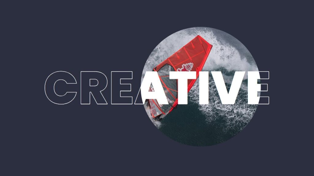
Small details can make a huge impact in today’s competitive web design landscape. One effective way to capture visitors’ attention is through Creative Banner Hover Effects using CSS & JavaScript. These effects can give your website a dynamic, polished feel and engage users by adding a layer of interactivity. Best of all, you don’t need extensive programming knowledge to implement them!
In this blog, we’ll explore some creative banner hover effects using CSS and JavaScript. We’ll cover how to design clean, responsive, and attention-grabbing banners that elevate the user experience.
Why Use Banner Hover Effects?
Hover effects play a crucial role in modern web design by:
- Engaging users through visual cues that encourage exploration
- Improving UI/UX by providing feedback and enhancing interactivity
- Enhancing brand identity with memorable animations
- Driving clicks and conversions by drawing attention to important banners
CSS and JavaScript can create effects that are lightweight and fast-loading, making them ideal for optimizing user experience without sacrificing website performance.
Basic Setup: HTML Structure for a Banner
Before diving into styling and animations, let’s set up a simple HTML structure for our banner. This example provides a container with a banner image and overlay text.
<!DOCTYPE html>
<html lang="en">
<head>
  <title>Banner Hover Effects</title>
  <link rel="stylesheet" type="text/css" href="style.css">
</head>
<body>
  <div class="banner" data-text="Creative"></div>
  <script>
    let banner = document.querySelector('.banner');
    banner.onmousemove = function(e) {
      let x = e.pageX - banner.offsetLeft;
      let y = e.pageY - banner.offsetTop;
      banner.style.setProperty('--x', x + 'px');
      banner.style.setProperty('--y', y + 'px');
    }
  </script>
</body>
</html>
This basic setup can be modified to suit various designs and hover effects. Now, let’s explore some unique hover effects.
CSS-Only Banner Hover Effects
@import url('https://fonts.googleapis.com/css?family=Poppins:200,300,400,500,600,700,800,900&display=swap');
*
{
    margin: 0;
    padding: 0;
    box-sizing: border-box;
    font-family: 'Poppins', sans-serif;
}
body
{
    display: flex;
    justify-content: center;
    align-items: center;
    min-height: 100vh;
}
.banner
{
    position: relative;
    width: 100%;
    height: 100vh;
    background: #2c2f40;
    display: flex;
    justify-content: center;
    align-items: center;
    overflow: hidden;
}
.banner::before
{
    content: attr(data-text);
    position: absolute;
    font-weight: 800;
    text-transform: uppercase;
    font-size: 12em;
    color: transparent;
    -webkit-text-stroke: 1px #fff;
    z-index: 1;
}
.banner::after
{
    content: attr(data-text);
    position: absolute;
    inset: 0;
    font-weight: 800;
    text-transform: uppercase;
    font-size: 12em;
    color: #fff;
    -webkit-text-stroke: 1px #fff;
    z-index: 2;
    clip-path: circle(0px at var(--x) var(--y));
    transition: clip-path 0.1;
    background: url(bg.jpg);
    background-size: cover;
    display: flex;
    justify-content: center;
    align-items: center;
}
.banner:hover::after
{
    clip-path: circle(250px at var(--x) var(--y));
}
An Overview of CSS Styles
Font Import: The @import statement loads the “Poppins” font, giving a modern look to our banner text. Universal Reset: The * selector removes default padding, and margin, and ensures box-sizing: border-box across all elements.Body Styling: Centers the banner vertically and horizontally within the viewport.Banner Styling:
- Position:
relativepositions the banner container relative to its normal position, which is essential for overlay positioning. - Background: A dark background color (
#2c2f40) ensures the hover effect stands out. - Overflow: Hidden to keep the text effect contained within the banner boundaries.
Before and After Pseudo-Elements:
- Before (
::before): Displays the outlined text using-webkit-text-stroke. The color is set to transparent, creating a border effect. - After (
::after):- Displays the same text but fills it with an image.
clip-path: Initially set to a tiny circle at the cursor location, set by CSS variables (var(--x)andvar(--y)) for dynamic positioning.- On hover, the circle expands to reveal the background image within the text.
Adding the Hover Effect
The clip-path changes from a small circle to a larger one when the banner is hovered, creating a smooth, zoomed-in reveal effect within the text.
This effect uses only CSS and can be customized by adjusting the font-size, clip-path values, or the background image. Give it a try, and make your banners stand out without the need for JavaScript!
Further Customization Tips
- Experiment with Backgrounds: Use different images, gradients, or even videos as the background to add a unique style.
- Adjust Clip-Path Size and Speed: Tweak the
clip-pathsize and transition timing for smoother or faster animations. - Try Different Fonts and Colors: Change the font family, weight, or color to better align with your brand identity.
- Responsive Design: Use media queries to adapt the font size and
clip-pathradius for smaller screens to ensure that the effect looks good across devices.
Wrapping Up
Adding creative banner hover effects using CSS and JavaScript can greatly enhance your website’s look and feel. Whether you’re looking for subtle transitions or bold, interactive elements, these hover effects can help your banners stand out and encourage user engagement.
Experiment with the ideas above, and don’t hesitate to mix and match effects to create something unique. With practice, you’ll be able to develop custom banner animations that will make your site more appealing and memorable!
Conclusion
With just CSS, you can add impactful hover effects that give your banners a polished and interactive feel. This CSS-only solution provides a simple yet engaging way to reveal background images with an animated clip path, elevating your web design with minimal code.
This technique is flexible and can be easily customized to match the style and tone of your website. Experiment with different settings to create a hover effect that’s both visually appealing and functionally effective.
📥 Download the Complete Source Code
With beautiful, interactive banner effects, you can make your website come to life without using JavaScript! To get started right away, get the source code now.


