Table of Contents
Introduction to Parallax Text Effects
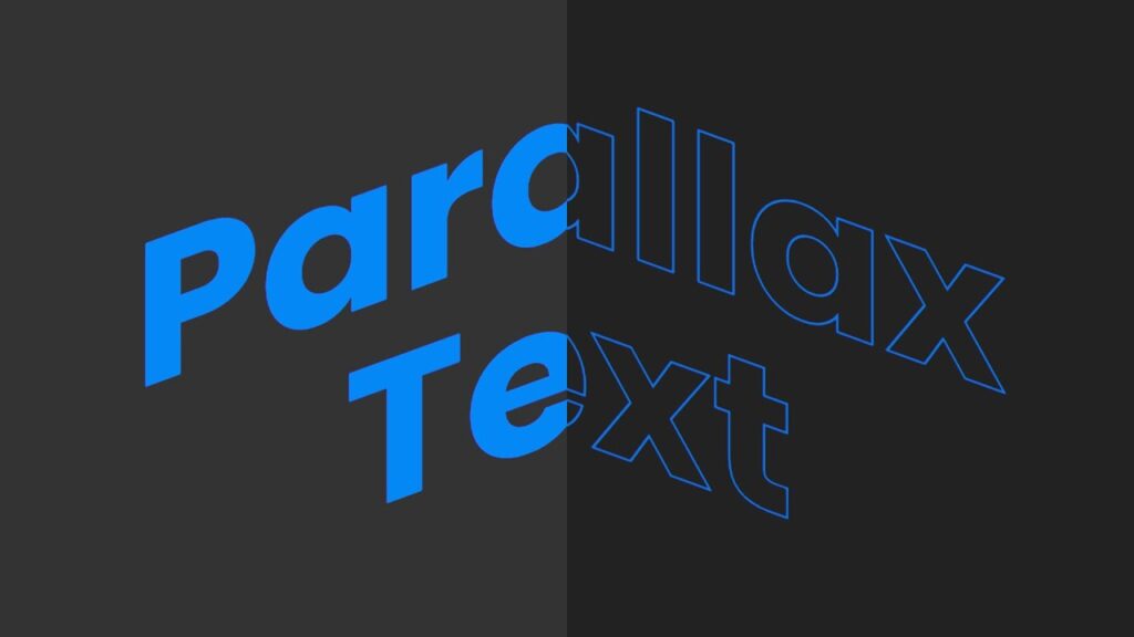
Parallax text effects create an illusion of depth by moving elements at different speeds as users interact with the page. This technique enhances visual appeal and improves user engagement.(Source)
How Does Parallax Work?
- The background and text move at different speeds.
- It creates a 3D-like effect when users move their mouse.
- Enhances the interactivity of a webpage.
Why Use Parallax Text Effects?
Parallax effects have several advantages:
✅ Enhances Visual Appeal – Makes your website more modern and engaging.
✅ Improves User Interaction – Encourages visitors to explore the site.
✅ Increases Retention – Users are more likely to stay longer on the page.
How Parallax Text Effects Work in JavaScript?
- Detect Mouse Movement – Using JavaScript’s
mousemoveevent. - Calculate Offsets – Adjusting the text based on cursor position.
- Apply Transformations – Using
translateX()for horizontal movement.
Setting Up the Basic HTML Structure
We start by creating a simple HTML template:
<!DOCTYPE html>
<html lang="en">
<head>
	<meta charset="UTF-8">
	<meta name="viewport" content="width=device-width, initial-scale=1.0">
	<title>Parallax Text Effects</title>
	<link rel="stylesheet" href="style.css">
</head>
<body>
	<section>
		<div class="skew1">
			<h2 class="layer">Parallax<br>Text</h2>
		</div>
		<div class="textBox">
			<div class="skew2">
				<h2 class="layer">Parallax<br>Text</h2>
			</div>
		</div>
	</section>
	<script src="script.js"></script>
</body>
</html>
- The
<h2>elements will move based on mouse position. - We link an external CSS file for styling and JavaScript for animation.
Styling the Parallax Text with CSS
Now, let’s style the page with CSS:
@import url('https://fonts.googleapis.com/css?family=Poppins:200,300,400,500,600,700&display=swap');
*
{
	margin: 0;
	padding: 0;
	box-sizing: border-box;
	font-family: 'Poppins', sans-serif;
}
section
{
	position: relative;
	width: 100%;
	height: 100vh;
	background: #222;
	overflow: hidden;
}
.textBox
{
	position: absolute;
	width: 100%;
	height: 100vh;
	background: #333;
	clip-path: polygon(0 0,50% 0,50% 100%,0% 100%);
}
h2
{
	position: absolute;
	width: 100%;
	text-align: center;
	font-size: 12em;
	color: transparent;
	-webkit-text-stroke: 2px #0876cf;
	cursor: pointer;
}
.textBox h2
{
	color: #0488f5;
}
.skew1
{
	position: relative;
	top: 200px;
	transform: skewY(20deg);
}
.skew2
{
	position: relative;
	top: 200px;
	transform: skewY(-20deg);
}
Key Features of This Styling:
✅ Uses clip-path to create a unique split effect.
✅ Applies skewY() to enhance the dynamic effect.
✅ Uses -webkit-text-stroke for a glowing outline effect.
Implementing the Parallax Effect with JavaScript
Now, we add interactivity using JavaScript:
document.addEventListener('mousemove', parallax);

function parallax(e) {
    document.querySelectorAll('.layer').forEach(layer => {
        let x = (window.innerWidth - e.pageX * 2) / 2;
        layer.style.transform = `translateX(${x}px)`;
    });
}
Explanation of the Code:
mousemoveevent detects user movement.querySelectorAll('.layer')selects all parallax text elements.translateX()moves the text dynamically based on the cursor position.-
Making the Parallax Effect Responsive
Handling Different Screen Sizes
To ensure responsiveness, we modify the text size based on screen width:
@media (max-width: 768px) {
	h2 {
		font-size: 6em;
	}
}
@media (max-width: 480px) {
	h2 {
		font-size: 4em;
	}
}
What is the best way to implement parallax text?
Using CSS transformations (transform: translateX()) and JavaScript (mousemove) ensures smooth motion effects.
Does parallax slow down a website?
It can if not optimized properly. Use GPU-accelerated properties (transform, opacity) for better performance.
Can I use parallax effects without JavaScript?
Yes! CSS-only parallax can be achieved using scroll, but JavaScript provides better control.
How do I make parallax animations smoother?
Use requestAnimationFrame() instead of mousemove for better performance.
Reduce the number of moving elements to avoid lag.
Conclusion
The Parallax Text Effect is a powerful way to add motion and depth to your website. With HTML, CSS, and JavaScript, you can create smooth, interactive animations that improve user engagement.
Now, try it out on your next project! 🚀
[download_button link=”https://drive.google.com/uc?export=download&id=1_E-WoVxP4HpOkh7CZF8YGP3mxrXO-4Qg”]
- HTTPS Encryption Explained for Beginners: What It Is & Why It MattersIn today’s digital world, HTTPS encryption plays a crucial role in keeping our online activities safe. Whether you’re shopping, banking, or simply browsing the web, HTTPS ensures that the information you share is protected from hackers eyes. Unlike its predecessor, HTTP, HTTPS encryption provides a secure connection between your browser and the website, ensuring that…
- Top 10 Best JavaScript Frameworks in 2025 for DevelopersAs JavaScript continues to dominate web development, the demand for powerful, flexible, and efficient JavaScript frameworks has surged. These frameworks streamline the development process, making it easier to create complex web applications, interactive websites, and dynamic user interfaces. Whether you’re a seasoned developer or a beginner, knowing which JavaScript frameworks are the best in 2025…
- React is Deprecated: The Bold Future of Web DevelopmentReact is Deprecated: What’s Next for Developers? In February 2025, the React team made a significant announcement that has shaken up the web development community. They officially deprecated Create React App (CRA), one of the most popular tools for setting up React applications. But does this mean that React is deprecated? Absolutely not. React remains…
- Our Services Box Hover Effects | CSS CardsEnroll My Course : Next Level CSS Animation and Hover Effects … source
- CSS Circular Image Rotate Animation Effectssource


