Table of Contents
Create Stunning Visual Effects with Pure CSS Split Slider
When it comes to modern web design, creating a visually engaging experience is key. One such interactive effect that has gained popularity in recent years is the “Pure CSS Split Slider.” If you’re looking to add a dynamic and smooth sliding animation to your website without relying on JavaScript or external libraries, this is the perfect solution. In this post, we’ll explore how to build a stunning Pure CSS Split Slider using only HTML and CSS.(source)
What is a Pure CSS Split Slider?
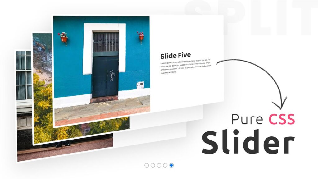
A Pure CSS Split Slider is a creative web design element that divides the slider into two sections, each of which behaves independently to create a visually appealing transition. Unlike traditional sliders, which often rely on JavaScript for animation effects, a Pure CSS Split Slider uses the power of CSS animations to achieve smooth transitions and engaging visual effects.
The unique aspect of a Pure CSS Split Slider is that it divides the slider into two halves. Each half rotates and animates as the user interacts with the navigation, creating a 3D-like effect. This is achieved by using CSS transforms, rotateX(), and transition properties to animate the different “faces” of the slider.
How Does the Pure CSS Split Slider Work?
Below is the step-by-step breakdown of the HTML and CSS code used to create this effect.
HTML Structure
The HTML structure of the Pure CSS Split Slider is relatively simple. It consists of a container <div> with a list of slides (<ul>), each represented by a <li> element. Each slide has two “faces,” each containing an image and content (e.g., heading, text). These faces will rotate to create the split effect.
<html>
<head>
    <title>Pure CSS Split Slider</title>
    <link rel="stylesheet" href="style.css">
</head>
<body>
    <div class="slider">
        <ul>
            <li>
                <input type="radio" name="slide" checked="checked">
                <div class="slide">
                    <div class="face face1">
                        <img src="bg1.jpg" alt="Slide 1">
                    </div>
                    <div class="face face2">
                        <div class="content">
                            <h2>Slide One</h2>
                            <p>Description for slide one.</p>
                        </div>
                    </div>
                </div>
            </li>
            <!-- Additional slides go here -->
        </ul>
    </div>
</body>
</html>
Each slide has an input of type radio, which allows users to select which slide to view. The images in the face1 div will rotate in one direction, and the content in the face2 div will rotate in the opposite direction, creating a stunning visual split effect.
CSS Styling and Animation
The magic happens in the CSS, where we use CSS transforms, rotations, and transitions to animate the split effect. Let’s break down the key parts:
Positioning: We use absolute positioning to align the slider faces and center them within the container.
Transformations: The
rotateX()function is used to rotate the faces in 3D space, whiletransform-originis adjusted to create a flip effect from the top or bottom.Transitions: We add smooth transitions to the rotation so that the slider transitions look seamless.
Here’s the CSS that powers the Pure CSS Split Slider:
@import url('https://fonts.googleapis.com/css?family=Poppins:300,400,500,700,800,900');

* {
    margin: 0;
    padding: 0;
    box-sizing: border-box;
    font-family: 'Poppins', sans-serif;
}

.slider {
    position: relative;
    width: 100%;
    height: 100vh;
    overflow: hidden;
}

ul {
    display: flex;
    justify-content: center;
    align-items: flex-end;
    width: 100%;
    height: 100%;
}

ul li {
    list-style: none;
}

ul li input {
    position: relative;
    z-index: 1000;
    width: 20px;
    height: 20px;
    margin: 0 5px;
}

ul li .slide {
    position: absolute;
    top: 0;
    left: 0;
    width: 100%;
    height: 100%;
}

ul li .slide .face {
    position: absolute;
    width: 50%;
    height: 100%;
    background: #fff;
}

ul li .slide .face.face1 {
    left: 0;
    transform-origin: top;
    transform: rotateX(90deg);
    transition: transform 1s;
}

ul li .slide .face.face1 img {
    position: absolute;
    top: 0;
    left: 0;
    width: 100%;
    height: 100%;
    object-fit: cover;
}

ul li .slide .face.face2 {
    right: 0;
    transform-origin: bottom;
    transform: rotateX(90deg);
    display: flex;
    justify-content: center;
    align-items: center;
    transition: transform 1s;
}

ul li .slide .face.face2 h2 {
    font-size: 4em;
    color: #333;
}

ul li .slide .face.face2 p {
    font-size: 1.1em;
    color: #333;
    line-height: 1.7em;
}

ul li input[type="radio"]:checked ~ .slide .face.face1 {
    transform: rotateX(0deg);
    transition: transform 1s;
    transform-origin: bottom;
}

ul li input[type="radio"]:checked ~ .slide .face.face2 {
    transform: rotateX(0deg);
    transition: transform 1s;
    transform-origin: top;
}
How the Animation Works
- Initially, each slide is divided into two sections:
face1(the image) andface2(the content). Both sections are rotated by 90 degrees, making them invisible to the viewer. - When a user selects a slide (via the radio input), the corresponding
face1andface2rotate back to their normal position using therotateX(0deg)transform, revealing the content and image. - The
transform-originproperty is used to control the pivot point for the rotations, making it appear as if the faces are flipping open from either the top or bottom.
Why Choose a Pure CSS Split Slider?
- No JavaScript Required: This approach doesn’t rely on JavaScript or any external libraries, making the implementation lighter and faster.
- Smooth Transitions: The CSS transitions provide a smooth and visually appealing effect.
- Customizable: You can easily change the images, content, and animations to fit your website’s design and theme.
- Performance: Because it’s built using pure CSS, it’s more performance-friendly than JavaScript-heavy solutions, especially for mobile devices.
Conclusion
The Pure CSS Split Slider is a powerful tool to create visually stunning websites. By leveraging CSS transforms and transitions, you can easily add a dynamic slider effect without the need for JavaScript. Whether you’re showcasing products, images, or content, this effect will certainly capture your audience’s attention.
Give it a try and see how easy it is to implement this effect on your own website. Don’t forget to tweak the styles and animations to fit your brand’s aesthetic!
Ready to implement the Pure CSS Split Slider on your website? Download the full code now and start customizing the split slider effect with your own images and content. Click the link below to get started!
[download_button link=”https://drive.google.com/u/0/uc?id=1hunMhbkYMIJRQEhj0kb_NXJWp3TWU1fY&export=download”]


