Table of Contents
Creative Radio Buttons Using HTML & CSS
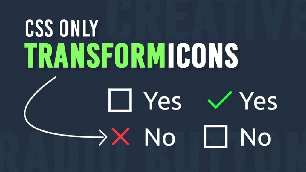
Radio buttons are an essential part of web forms, but their default design is often plain and uninspiring. With a touch of CSS, we can make them more visually appealing and interactive. In this blog, we will explore how to create stylish and creative radio buttons using HTML & CSS, incorporating animations and a unique checkmark and cross design.
Why Customize Radio Buttons?
Default radio buttons lack personality and can sometimes be difficult to differentiate. By customizing them:
✅ We improve user experience.
✅ We enhance the visual appeal of the form.
✅ We make selection clearer with animations.
HTML Structure: Creative Radio Buttons using Html & CSS
The HTML code for this project is simple yet effective. It consists of a container with a question and two radio buttons labeled “Yes” and “No.”
<!doctype html>
<html>
	<head>
		<meta charset="utf-8">
		<title>Creative Radio Buttons || TechyTechs</title>
		<link rel="stylesheet" href="style.css">
	</head>
	<body>
		<div class="container">
			<p>Are you Like This ?</p>
			<label>
				<input type="radio" name="yesNo">
				<span class="check"></span>
				Yes
			</label>
			<label>
				<input type="radio" name="yesNo">
				<span class="cross"></span>
				No
			</label>
		</div>
	</body>
</html>
Breaking Down the HTML:
✔ The <p> tag displays the question.
✔ Each <label> contains:
- A hidden
<input>of type"radio"for selection. - A
<span>element that will be styled to display a checkmark (✔) for “Yes” and a cross (✖) for “No.” - The respective label text (“Yes” or “No”).
CSS Styling: Bringing Creativity to Life Of Creative Radio Buttons using Html & CSS
The CSS adds the magic! It enhances the radio buttons by replacing them with stylish check and cross indicators.
@import url('https://fonts.googleapis.com/css2?family=Ubuntu:wght@300;400;500;700&display=swap');

* {
	margin: 0;
	padding: 0;
	box-sizing: border-box;
  	font-family: 'Ubuntu', sans-serif;
}

body {
	display: flex;
	justify-content: center;
	align-items: center;
	min-height: 100vh;
	background: #1e2b3b;
}

.container {
	position: relative;
	display: flex;
	flex-direction: column;
}

p {
	color: #fff;
	font-size: 2em;
	margin-bottom: 10px;
}

label {
	position: relative;
	margin: 5px 0;
	cursor: pointer;
	display: flex;
	align-items: center;
	font-size: 2em;
	color: #fff;
}

label input {
	appearance: none;
	display: none;
}

label span {
	position: relative;
	display: inline-block;
	width: 30px;
	height: 30px;
	margin-right: 15px;
	transition: 0.5s;
}

label span::before {
	content: '';
	position: absolute;
	bottom: 0;
	left: 0;
	width: 100%;
	height: 3px;
	background: #fff;
	box-shadow: 0 -27px 0 #fff;
	transition: 0.5s;
}

label input:checked ~ span.check::before {
	background: #0f0;
	box-shadow: 0 0 0 transparent;
}

label input:checked ~ span.cross::before {
	background: #f00;
	box-shadow: 0 0 0 transparent;
	transform: rotate(-45deg) translate(10px,-9px);
}

label span::after {
	content: '';
	position: absolute;
	bottom: 0;
	left: 0;
	width: 3px;
	height: 100%;
	background: #fff;
	box-shadow: 27px 0 0 #fff;
	transition: 0.5s;
}

label input:checked ~ span.check::after {
	height: 50%;
	background: #0f0;
	box-shadow: 0 0 0 transparent;
}

label input:checked ~ span.check {
	transform: rotate(-45deg) translate(7px,-7px);
}

label input:checked ~ span.cross::after {
	background: #f00;
	box-shadow: 0 0 0 transparent;
	transform: rotate(-45deg) translate(10px,10px);
}
How It Works
✅ Custom Fonts & Layout
We import the Ubuntu font and set up a modern, dark background with centered content.
✅ Hiding the Default Radio Buttons
The appearance: none; display: none; properties hide the traditional radio button, replacing it with a customized checkmark and cross.
✅ Checkmark & Cross Animations
- The checkmark appears in green when “Yes” is selected.
- The cross turns red and rotates when “No” is selected.
✅ Smooth Transitions
The transition: 0.5s; ensures a smooth animation when selecting an option.
Final Result
When a user selects “Yes,” a green checkmark appears.
When they choose “No,” a red cross appears with a stylish rotation effect.
This creative approach makes radio buttons more engaging, user-friendly, and visually appealing! 🎨✨
Conclusion
Using HTML & CSS, we transformed standard radio buttons into an eye-catching, animated selection system. This technique not only enhances aesthetics but also improves usability.
Try it out and add your own creative touches! 🚀💡
Enhance your web forms with creative radio buttons using HTML & CSS! This stylish design replaces default radio buttons with animated checkmarks and crosses, making selections more engaging and visually appealing. With smooth transitions and a modern layout, this customization improves user experience and adds a unique touch to your forms. 💡✨
💾 Download the Full Source Code 👉
[download_button link=”https://drive.google.com/uc?export=download&id=1fUABZmZYQUmjLTv-SU7UJpnhmv_27K7c”]
Why should I customize radio buttons?
Customizing radio buttons improves their visual appeal, enhances user experience, and makes selections clearer with animations and styling.
Can I use this code in my project?
Yes! The provided HTML & CSS code is free to use and customize as per your project needs.
How does the checkmark and cross animation work?
When a user selects an option, CSS transitions and transform properties change the appearance of the checkmark (✔) and cross (✖) dynamically.
Is this design mobile-friendly?
Yes! The design is fully responsive, ensuring a seamless experience on both desktop and mobile devices.
Can I change the colors of the checkmark and cross?
Absolutely! You can modify the CSS properties like background-color to match your branding or theme.


