Table of Contents
How to Create Stunning Ambient Light Effects with CSS
In the world of modern web design, adding dynamic visual effects can elevate the user experience, making your website not only visually appealing but also interactive. One such effect that has gained attention in recent years is Ambient Light Effects.
These effects create an atmospheric glow that gives the page a sense of depth, movement, and energy. In this blog post, we’ll explore how you can create an eye-catching Ambient Light Effect using just HTML and CSS.(source)
What Are Ambient Light Effects?
Ambient Light Effects are visual design techniques that simulate light sources and reflections to add a sense of realism and atmosphere to a webpage. By manipulating properties such as color, shadows, and gradients, designers can simulate the effect of a glowing light in a 3D space. In web design, this effect is often used to make elements appear to shine, glow, or interact with light sources dynamically.
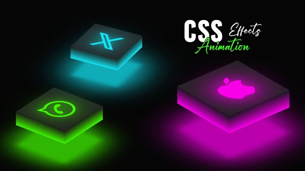
One example of this is the glowing cube effect in the code example provided below. The cube is animated to rotate while emitting a colorful light effect, creating a mesmerizing 3D illusion.
How Does the Ambient Light Effect Work?
In this example, we will be creating a rotating cube with ambient lighting that changes color over time. The cube will also have a glowing light effect coming from its center. We will achieve this using CSS animations and keyframes, alongside linear gradients and transformations.
HTML Structure
Let’s start by looking at the HTML code that forms the basis for our ambient light effect. The cube element consists of multiple layers created with span tags, and a top layer that houses the glowing icon.
<html lang="en">
<head>
    <title>Ambient Light Effects | TechyTechs</title>
    <link rel="stylesheet" href="style.css">
    <link rel="stylesheet" href="https://cdnjs.cloudflare.com/ajax/libs/font-awesome/6.6.0/css/all.min.css" integrity="sha512-Kc323vGBEqzTmouAECnVceyQqyqdsSiqLQISBL29aUW4U/M7pSPA/gEUZQqv1cwx4OnYxTxve5UMg5GT6L4JJg==" crossorigin="anonymous" referrerpolicy="no-referrer" />
</head>
<body>
    <div class="cube">
        <div class="top">
            <i class="fa-brands fa-x-twitter"></i>
        </div>
        <div class="box">
            <span style="--i:0;"></span>
            <span style="--i:1;"></span>
            <span style="--i:2;"></span>
            <span style="--i:3;"></span>
        </div>
    </div>
</body>
</html>
Here, the <div class="cube"> contains a box with four span elements arranged to form the faces of the cube. The icon (in this case, a Twitter icon) is displayed at the top of the cube. The effect is created by animating the cube and changing its color dynamically using CSS.
CSS Styling and Animation
The real magic happens in the CSS. We use keyframes to animate the rotation of the cube and the color change, which creates the dynamic ambient light effect.
Here’s the breakdown of the CSS code:
* {
    margin: 0;
    padding: 0;
    box-sizing: border-box;
}

body {
    display: flex;
    justify-content: center;
    align-items: center;
    min-height: 100vh;
    background: #050505;
    animation: colorChange 4s linear infinite;
}

@keyframes colorChange {
    0%, 100% {
        filter: hue-rotate(270deg);
    }
    50% {
        filter: hue-rotate(360deg);
    }
}

.cube {
    position: relative;
    width: 400px;
    height: 100px;
    transform-style: preserve-3d;
    animation: animate 4s linear infinite;
}

@keyframes animate {
    0% {
        transform: rotateX(-30deg) rotateY(0deg);
    }
    100% {
        transform: rotateX(-30deg) rotateY(360deg);
    }
}

.cube div.box {
    position: absolute;
    top: 0;
    left: 0;
    width: 100%;
    height: 100%;
    transform-style: preserve-3d;
}

.cube div span {
    position: absolute;
    top: 0;
    left: 0;
    width: 100%;
    height: 100%;
    background: linear-gradient(rgba(21, 21, 25, 1), rgba(255, 6, 6, 1));
    transform: rotateY(calc(90deg * var(--i))) translateZ(200px);
    display: flex;
    justify-content: center;
    align-items: center;
    transform-style: preserve-3d;
}

.top {
    position: absolute;
    top: 0;
    left: 0;
    display: flex;
    justify-content: center;
    align-items: center;
    width: 400px;
    height: 400px;
    background: #222;
    transform-style: preserve-3d;
    transform: rotateX(90deg) translateZ(200px);
}

i {
    position: absolute;
    transform-style: preserve-3d;
    transform: translateZ(0px);
    color: rgba(255, 6, 6, 1);
    font-size: 15em;
    text-shadow: 0 0 50px rgba(255, 6, 6, 0.25),
                 0 0 100px rgba(255, 6, 6, 0.5),
                 0 0 200px rgba(255, 6, 6, 0.75),
                 0 0 300px rgba(255, 6, 6, 1);
}

.top::before {
    content: '';
    position: absolute;
    top: 0px;
    left: 0px;
    width: 400px;
    height: 400px;
    background: rgba(255, 6, 6, 1);
    opacity: 0.75;
    transform: translateZ(-250px);
    filter: blur(20px);
    box-shadow: 0 0 120px rgba(255, 6, 6, 0.2),
                0 0 200px rgba(255, 6, 6, 0.4),
                0 0 300px rgba(255, 6, 6, 0.6),
                0 0 400px rgba(255, 6, 6, 0.8),
                0 0 500px rgba(255, 6, 6, 1);
}
Key Features of the Ambient Light Effect
Dynamic Color Change: The
@keyframes colorChangeanimation applies a continuous hue-rotate filter to the entire webpage. This effect shifts the colors over time, creating a subtle lighting effect that changes as the page progresses.3D Cube Animation: The cube itself rotates using the
@keyframes animateanimation, which causes the cube to rotate around the X and Y axes. This creates a smooth 3D effect that adds depth and dynamism.Glowing Light: The glowing light effect around the cube is created using the
box-shadowproperty, which simulates light radiating from the cube. Combined with the blurred background (::before), this effect creates a stunning ambient glow.Gradient Backgrounds: The use of linear gradients on the cube’s faces (
spanelements) enhances the ambient light effect, making the transitions between colors smoother and more visually striking.
Why Use Ambient Light Effects?
- Visual Appeal: Ambient lighting effects can make your website look more modern, eye-catching, and professional.
- Interactivity: These effects make your website feel more dynamic and engaging, as users will notice the subtle changes in color and animation.
- Improved User Experience: When used correctly, these effects can enhance the overall feel of the website, creating an atmosphere that matches the tone of your content.
Conclusion
Incorporating Ambient Light Effects into your web design can give your website a futuristic, high-tech look. Whether you’re creating a glowing 3D cube or adding subtle light animations to elements, the possibilities are endless with CSS. Best of all, these effects require no JavaScript, which means faster load times and better performance.
So why not try it out yourself? Experiment with the code provided and adjust the colors, timing, and animations to suit your project. The glowing, rotating cube effect is just the beginning of the ambient light possibilities that CSS can bring to your website!


