Table of Contents
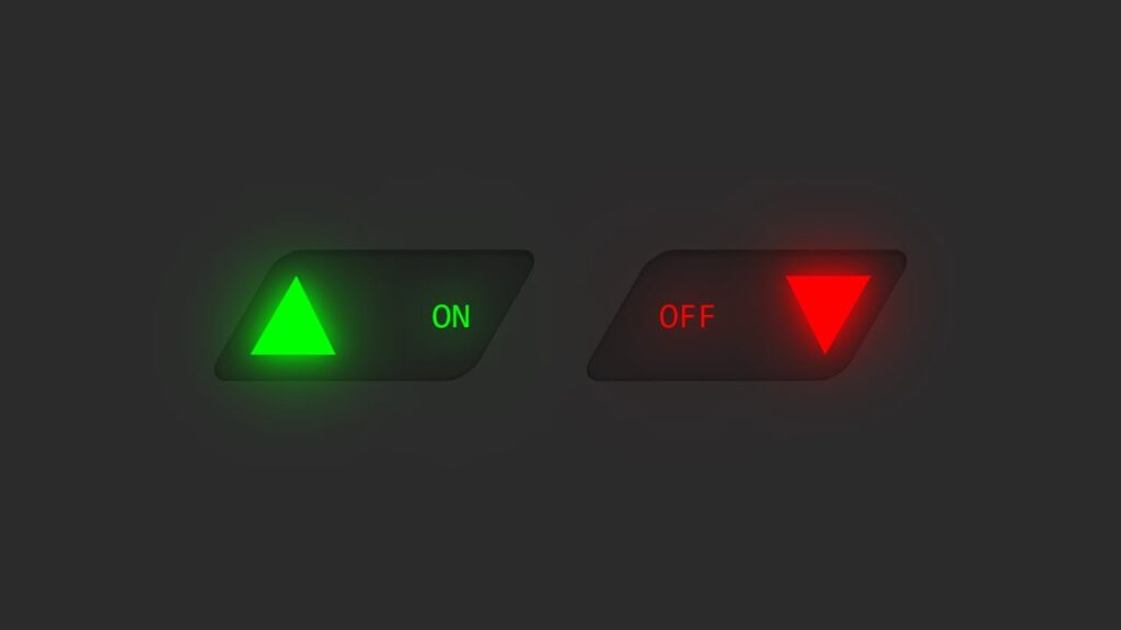
CSS Custom Triangle– Checkbox buttons are a fundamental UI component, but traditional checkboxes can look plain and uninspiring. In this post, we’ll create a custom triangle-shaped checkbox button using HTML and CSS that looks modern and interactive.
Features of This Checkbox Design
A sleek, skewed button with a glowing triangle toggle.
A smooth transition when toggling the checkbox.
Uses only HTML & CSS, without any JavaScript.
Let’s dive into the implementation!
CSS Custom Triangle HTML Structure
<!DOCTYPE html>
<html>
<head>
    <title>CSS Checkbox UI Design || Techytechs</title>
    <link rel="stylesheet" type="text/css" href="style.css">
</head>
<body>
    <label>
        <input type="checkbox">
        <text>Off</text>
        <text>On</text>
        <span class="angle"></span>
    </label>
</body>
</html>
Explanation:
The
<label>element wraps the entire button.A hidden
<input type="checkbox">is used to toggle states.Two
<text>elements represent the “On” and “Off” states.A
<span class="angle">acts as the glowing triangle toggle.
CSS Custom Triangle – CSS Styling
* {
    margin: 0;
    padding: 0;
    box-sizing: border-box;
    font-family: Consolas, monospace;
}

body {
    display: flex;
    justify-content: center;
    align-items: center;
    min-height: 100vh;
    background: #2b2b2b;
}

label {
    position: relative;
    width: 120px;
    height: 60px;
    cursor: pointer;
    background: #222;
    transform: skewX(330deg);
    display: flex;
    justify-content: space-between;
    align-items: center;
    box-shadow: inset 0 2px 15px rgba(0,0,0,0.2),
                inset 0 2px 2px rgba(0,0,0,0.2),
                inset 0 -1px 1px rgba(0,0,0,0.2);
    border-radius: 10px;
}

label input {
    position: absolute;
    appearance: none;
}

.angle {
    position: absolute;
    border-left: 35px solid transparent;
    border-right: 30px solid transparent;
    border-bottom: 60px solid #0f0;
    filter: drop-shadow(0 0 10px #0f0) drop-shadow(0 0 30px #0f0);
    transform: skewX(30deg) scale(0.6) translateX(-16px);
    transition: 0.5s;
}

label input:checked ~ .angle {
    border-bottom: 60px solid #f00;
    filter: drop-shadow(0 0 10px #f00) drop-shadow(0 0 30px #f00);
    transform: skewX(30deg) scale(0.6) translateX(108px) rotate(180deg);
}

label text {
    padding: 10px 20px;
    transform: skewX(30deg);
    text-transform: uppercase;
    transition: 0.5s;
    color: #ccc;
}

label text:nth-child(2) {
    transform: skewX(30deg) scale(0);
    color: #f00;
    filter: drop-shadow(0 0 10px #f00) drop-shadow(0 0 30px #f00);
}

label input:checked ~ text:nth-child(2) {
    transform: skewX(30deg) scale(1);
}

label text:nth-child(3) {
    transform: skewX(30deg) scale(1);
    color: #0f0;
    filter: drop-shadow(0 0 10px #0f0) drop-shadow(0 0 30px #0f0);
}

label input:checked ~ text:nth-child(3) {
    transform: skewX(30deg) scale(0);
}
How It Works
Skewed Button Design: The
labelelement is skewed to create a unique button shape.Triangle Toggle Effect: The
.angleelement acts as the switch, transitioning smoothly.State Switching:
When unchecked, the triangle is green (
#0f0), and “On” text is visible.When checked, the triangle turns red (
#f00), and “Off” text appears.
Smooth Transitions: CSS animations ensure a fluid toggle effect.
Conclusion
This CSS Custom Triangle-shaped checkbox button offers a modern UI alternative to the traditional checkbox. It’s a great way to enhance the aesthetics of toggle buttons in web applications.
Feel free to tweak the colors and animations to match your project’s theme!
🔥 Try it out and let me know your thoughts in the comments! 🚀
Download the Code
Want to implement this CSS Custom Triangle button in your project?
[download_button link=”https://drive.google.com/uc?export=download&id=1OGSnwzDGpwjKwBny7QTp6PZvyGlyXN_V”]


