Table of Contents
Create Stunning Modern Button Hover Effects with CSS & JavaScript
When it comes to web design, small interactive elements like buttons can make a big impact on user experience. A well-designed Modern Button Hover Effect adds an engaging layer to your site, making it feel more dynamic and interactive. If you’re looking for an effective way to enhance the visual appeal of buttons, hover effects are a great solution.(source)
In this blog post, we’ll show you how to create eye-catching Modern Button Hover Effects using HTML, CSS, and a touch of JavaScript. We’ll guide you through the code step by step, so you can easily implement this design on your own website.
What Are Modern Button Hover Effects?
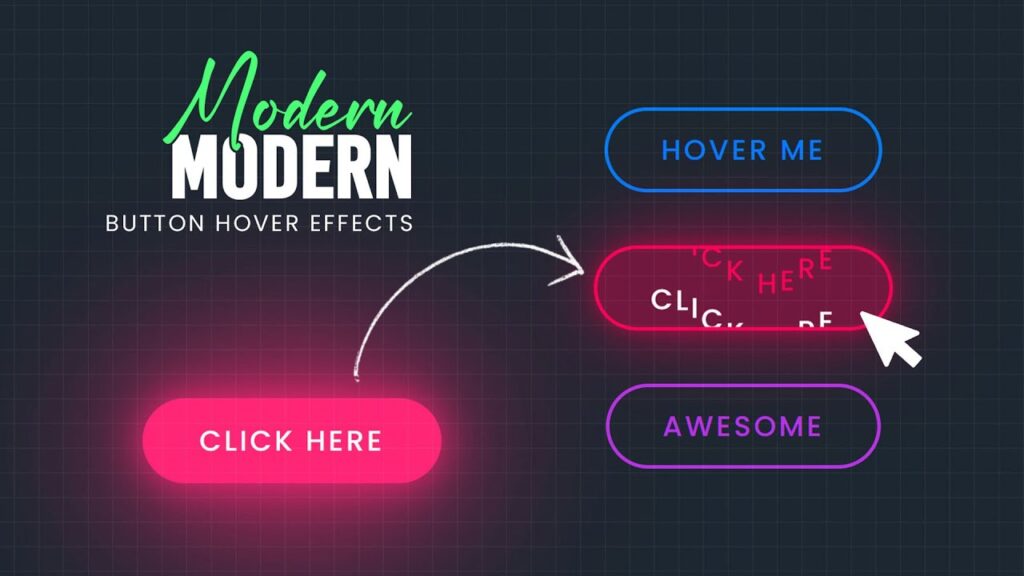
Modern Button Hover Effects are animations or transitions that occur when a user hovers their mouse pointer over a button. These effects can include color changes, shadows, scaling, text animations, and more. The goal is to create buttons that respond to user interactions in a visually appealing way, making the website feel more responsive and polished.
The button hover effect we’ll be implementing in this tutorial is a text-transforming effect with a dynamic glowing border that looks fantastic when users hover over the button. The text will animate upwards while the background color changes, creating an eye-catching effect.
HTML Structure
Let’s first take a look at the HTML code for the buttons. In this example, we have three buttons with different labels and custom color properties. These buttons will trigger the hover effect when the user interacts with them.
<!DOCTYPE html>
<html lang="en">
<head>
    <meta charset="UTF-8">
    <meta name="viewport" content="width=device-width, initial-scale=1.0">
    <title>Awesome Button Hover Effects</title>
    <link rel="stylesheet" type="text/css" href="style.css">
</head>
<body>
    <button class="button" style="--clr:#007BFF;">Hover Me</button>
    <button class="button" style="--clr:#ff0055;">Click Here</button>
    <button class="button" style="--clr:#b731e5;">Awesome</button>
    <script>
        const buttons = document.querySelectorAll('.button');
        buttons.forEach(button => {
                const text = button.textContent;
                button.innerHTML = '';

                for (let char of text) {
                        const span = document.createElement('span');
                        span.textContent = char === ' ' ? '\u00A0' : char;
                        button.appendChild(span);
                }

                const spans = button.querySelectorAll('span');

                button.addEventListener('mouseenter', () => {
                        spans.forEach((span, index) => {
                                setTimeout(() => {
                                    span.classList.add('hover')
                                }, index * 50);
                        });
                });
                button.addEventListener('mouseleave', () => {
                        spans.forEach((span, index) => {
                                setTimeout(() => {
                                    span.classList.remove('hover')
                                }, index * 50);
                        });
                });
        });
    </script>
</body>
</html>
In this HTML structure:
- Each button has a custom color that is set dynamically using inline CSS (
--clr). - We have three buttons with different text labels: “Hover Me,” “Click Here,” and “Awesome.”
- A script is used to split each button’s text into individual characters wrapped in
spanelements. This is necessary for creating the staggered text animation when the user hovers over the button.
JavaScript Code Explanation
The JavaScript code is used to split the button text into individual letters, which is crucial for the hover animation effect where each letter moves sequentially. Here’s how it works:
- Splitting Text: The JavaScript loops over each button and creates a
spanelement for each character in the button text. - Adding Hover Events: Event listeners are added to each button to detect when the user hovers (
mouseenter) or moves the mouse away (mouseleave). During hover, the spans are animated with a delay to achieve the staggered movement effect. - Animation Trigger: When the mouse enters or leaves the button, the class
hoveris added or removed from eachspanelement to trigger the text animation.
CSS Styling and Hover Effects
Now, let’s dive into the CSS code. This part controls the appearance and the hover animation of the buttons. The effect is achieved using CSS transitions and transformations.
@import url('https://fonts.googleapis.com/css?family=Poppins:200,300,400,500,600,700,800,900&display=swap');

* {
    margin: 0;
    padding: 0;
    box-sizing: border-box;
    font-family: 'Poppins', sans-serif;
}

body {
    display: flex;
    justify-content: center;
    align-items: center;
    flex-direction: column;
    min-height: 100vh;
    background: #1c2630;
    gap: 50px;
}

.button {
    position: relative;
    display: inline-block;
    padding: 10px 30px;
    font-size: 1em;
    background: var(--clr);
    background: transparent;
    color: var(--clr);
    font-weight: 500;
    border: 2px solid var(--clr);
    border-radius: 40px;
    overflow: hidden;
    cursor: pointer;
    letter-spacing: 0.1em;
    text-transform: uppercase;
    transition: 1s;
}

.button:hover {
    background: var(--clr);
    box-shadow: 0 0 25px var(--clr),
                0 0 100px var(--clr),
                0 0 150px var(--clr);
}

.button span {
    display: inline-block;
    transition: transform 0.5s;
    text-shadow: 0 35px #fff;
    position: relative;
    transform: translateY(0px);
}

.button:hover span.hover {
    transform: translateY(-35px);
}

.button span.hover {
    transform: translateY(-35px);
}
CSS Breakdown:
General Styles:
- We import the Poppins font family to give the buttons a modern and clean look.
- The
bodyis styled to center the buttons both horizontally and vertically with a dark background to make the button effect pop.
Button Styles:
- The buttons are given a transparent background initially (
background: transparent;) and a solid border with a custom color (--clr) set dynamically. - We add a smooth transition on hover for the background color and border.
- The buttons are given a transparent background initially (
Hover Effects:
- On hover, the button’s background changes to the color specified by the
--clrcustom property. - The
box-shadowproperty is used to create a glowing effect around the button, making it feel like it’s emitting light. - The text (created with
spanelements) moves up with a transform animation, which is triggered by adding the.hoverclass to each span.
- On hover, the button’s background changes to the color specified by the
Text Animation:
- The text is initially positioned with no vertical movement (
transform: translateY(0px)). - On hover, each
spanmoves up (transform: translateY(-35px)) to create a staggered text animation. Thespanelements transition smoothly thanks to thetransitionproperty.
- The text is initially positioned with no vertical movement (
Why Use Modern Button Hover Effects?
Visual Appeal: Buttons with hover effects provide a more engaging user experience. They grab attention and make the interface feel more interactive.
Enhanced User Interaction: Adding animation to buttons helps users understand that the button is clickable and provides feedback when they interact with it.
Customizable: The CSS and JavaScript structure can be easily modified to fit your website’s color scheme, style, and overall design language.
Conclusion
Incorporating Modern Button Hover Effects can greatly enhance the usability and aesthetic appeal of your website. By combining CSS and a little JavaScript, you can create buttons that not only look great but also offer smooth, interactive animations when users hover over them.
This effect is highly customizable—adjust the color, animation speed, and text style to match your website’s theme. The result will be sleek, modern buttons that improve the user experience and make your site stand out.


